食品海报的设计比较讲究,因为好的视觉效果才能引起人们的注意。下面的教程将介绍如何去设计一款有视觉冲击的海报。不过制作的时候需要一定的美术功底,部分元素需要用到鼠绘。
最终效果 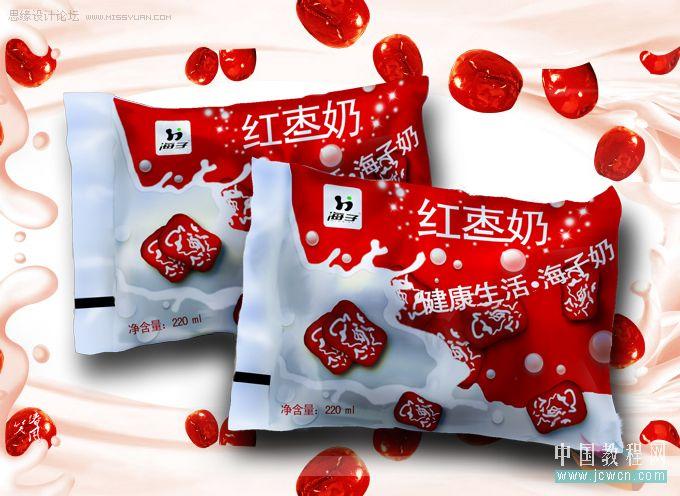
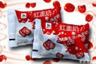
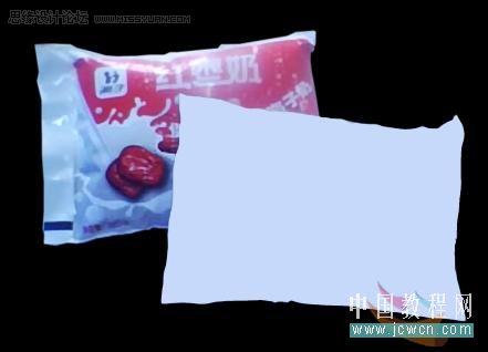
素材就是商店里到处卖的袋装牛奶。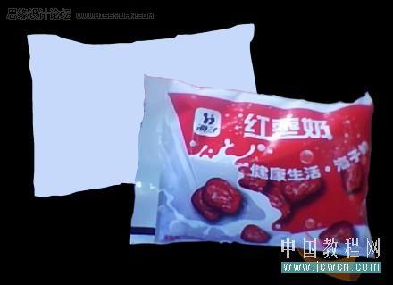
我们先来认识一下制作顺序: 一、做袋子;二、做‘衣服’上的背景;三、做大枣;四、做字体 五 做水珠 。。。
1 -1、如图勾出袋子外形,填上色块。
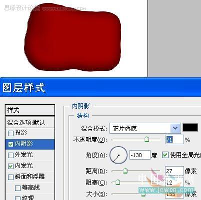
1-2、用钢笔勾选出阴影的地方,新建层-填上颜色较原图更深的颜色。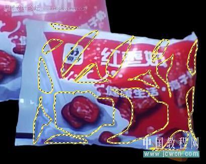
1-3、不取消选区-用缩进缩小选区,再填充更深的色,表示阴影。对本文感兴趣的朋友可以到这里与作者交流:
缩进在这里:
涂抹工具涂抹混色: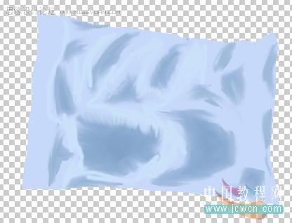
1-4、给袋子分出明暗交界来:
红色标出的地方,新建一层,填上黑色,高斯模糊。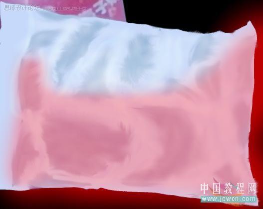
(本文来源于图老师网站,更多请访问https://m.tulaoshi.com)看模式的设置,透明度做适当修改。
1-5、用同样的方法,做出第2道暗面比第一道(更深)更暗。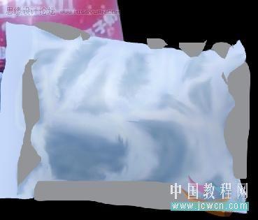
下图是效果,颜色不像袋子没有问题。因为还没穿衣服,涂得深一点也没问题,只要能显示明暗。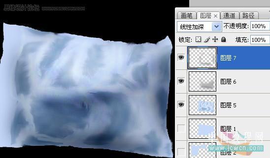
如法炮制,后面那个袋子也这样做,我先勾出暗的地方。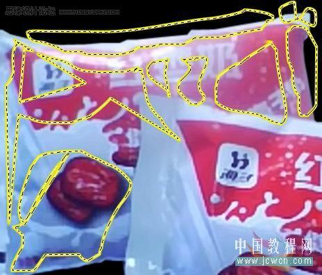
效果图。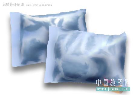
袋子就做完啦,来看第2步,背景的做法,先看图再讲做法。
2-1、新建层-填充背景色。 2-2、用磁性套索在照片上勾出牛奶的轮廓,液化或平滑填充白色。

2-3、收缩选区-平滑,变换选区-收缩右边,填充灰黄-浅灰双色渐变(颜色吸走就是啦)。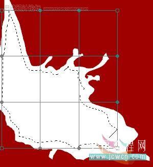
2-4、如法炮制,做出下图,渐变有3个,直接取色就可以啦。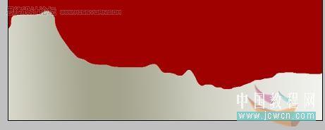
好啦,难的都做得差不多啦,下面来做大枣,我做得不好,光泽太亮太大了。 3-1、矩形做出选框-液化(在滤镜里)然后如图设置。
3-2、找个外发光的画笔,画上光泽,注意1跟线条的亮度是不一样的,这个自己把握吧!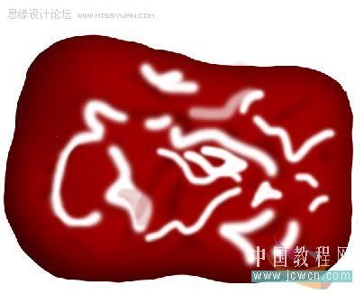
3-3、用加深工具-加上褶皱(顺着白色线条的一侧来加,不可任意乱加)。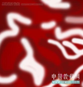
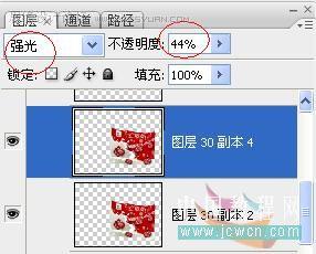
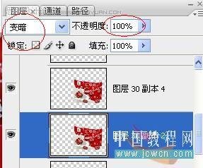
3-4、然后涂盖印章 CTRL+ALT+SHIFT+E 接着就复制好多个大枣,放好图层的位置 。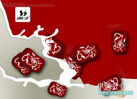
第四部、做文字,字体统一用黑体。 4-1、打上红枣奶,栅格化文字,用擦头擦掉【枣】字的两点和【奶】字左部首的下部分。
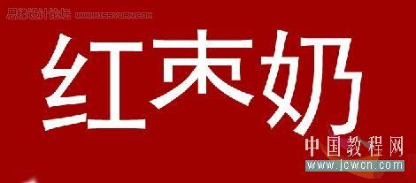
用矩形填充白色做出这个效果(凡是设计大都会用到修改字体的方法)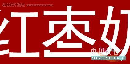
4-2、打上另一排字,变换选区,再做自由变形。
(本文来源于图老师网站,更多请访问https://m.tulaoshi.com)效果图。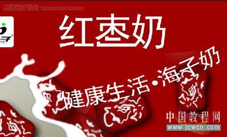
商标:
不记得怎么搞出来的了,大概给个参考教程吧。做法就是在这个水珠的基础上加个圆形渐变,在斜面与浮雕那个设置里面,可以修改水珠的颜色。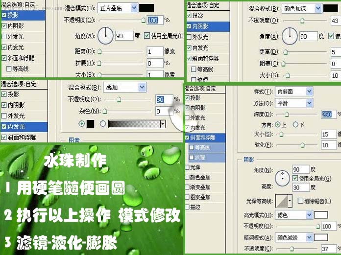
记得修改混合的模式0,不然看不到效果。 第五步、合成封面,十分重要的一步,直接看截图吧!把多余的边角用反向选定去掉。
完成,再看看效果: